originally posted August 17, 2013
May 2021: reformatted; some text revised as needed
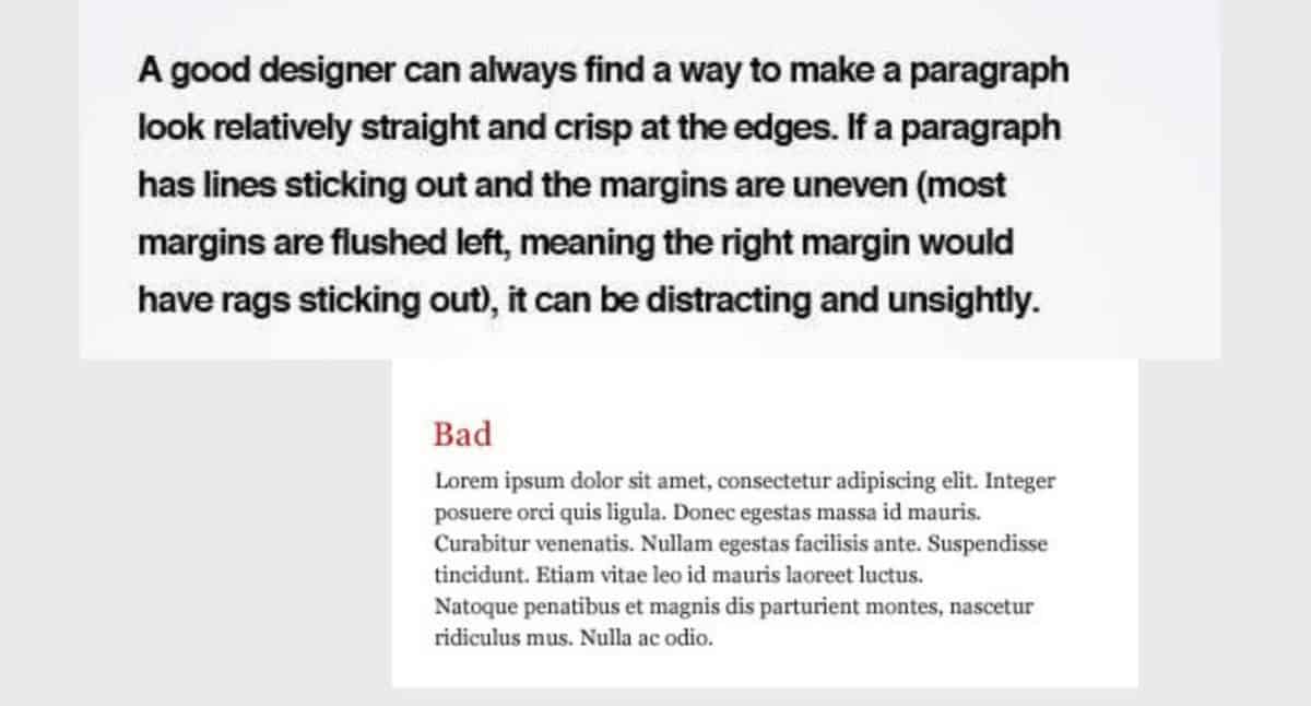
I don’t know if that raised your eyebrows or not, but unless you are an instructional designer you may not have known what “the rag” is. In simple terms, in publishing, the rag is the uneven, or ragged, edge of a block of text. What that means is that this paragraph, which is aligned so that text butts up against the left margin, has a right rag; text that is aligned against the right margin (such as the signature line, below) has a left rag; and text that is center-aligned has both a left and a right rag. Justified text (text that runs from margin to margin) does not technically have a rag; old-timers, though, may say it has a straight, or even, rag—regardless, it has no ragged text edges to worry about.
Justified text is also the most difficult text for beginning, poor, or borderline readers to focus on, follow, and comprehend. So, as a rule, publishers want ragged text. But they need it to be visually appealing and aesthetic so it works for the reader, to help lead them to the next line of text.
The truth is, a good paragraph rag can help lower the reading level of a piece of text. Unfortunately, the rags of today’s electronic texts can often not be controlled; however, if you are publishing on paper, or some other fixed medium, or if you are publishing to a PDF file, you do have control and you should take advantage of it.
Instructional design and the rag
One of my current clients is having issues with the rag on her left-aligned display text. To help her understand, I’ve pulled some guidelines from my instructional design background and listed them below. While designing a pleasing rag is a talent that takes training and practice, here are some of the basics I’ve presented to start her out:
- Do not allow obvious “hangovers”—a line of text in which several characters hang farther out than lines above or below.
- When possible, do not allow the rag to run in a straight or nearly straight line down the page, especially not for more than two or three lines.
- Do not allow “stacking”—ending consecutive lines with the same word.
- Avoid widows and orphans (short lines of text that end up alone at the end of a paragraph, column, or page) and singles (a lone word or end of a hyphenated word that winds up as the bottom line of a paragraph).
Fixing a rag
Three options exist for improving the look of a rag in professional publishing. A good rag wanders in and out from line to line to line in small, wavy increments that do not call attention to the ends of the lines or the white space they create. Good instructional designers always pay attention to the shapes created by the rag and make adjustments to decrease distractions.
The first option for fixing ragged text is simply to delete text or reword a paragraph. Of course, the author would have to be consulted before taking this action!
If recasting text is not possible, the second option is to adjust the kerning (the space between letters of a word) and tracking (the blank spaces between words) of text in a line. Adjusting kerning and tracking is easily accomplished with modern desktop publishing programs, and an adjustment of six or seven points in either direction is basically imperceptable to readers. This option is generally the most professional option and results in text that is easy for readers to follow.
If only one line needs adjusting, select the entire line at once and kern or track until the line length is where you want it. To adjust longer segments of text, select as much text as possible in the paragraph, starting with the first line that is not aligned as you want it. If the rag is still not right after kerning and tracking, “undo” and try a different segment.
The third option for manipulating a rag is hyphenation. Here are some guidelines to follow when hyphenating text:
- when necessary, do not break proper names;
- do not allow hyphens in two consecutive lines;
- do not allow more than two hyphens in one paragraph;
- do not leave only two letters of a hyphenated word on a line by themselves;
- try not to hyphenate a word that is already typically hyphenated; and
- do not create a widow, an orphan, or a single.
And remember: hyphenating words should be used as a last resort because doing so does make reading more difficult and can increase the reading level of text—objectives you’re trying to improve by adjusting the rag!
Stephen, the-freelance-editor.com
e-mail: editorial –at– Im Your Editor –dot– com
text: 832-233-0041
Feel free to like or share this post
or to leave a comment, all from our growing facebook presence
image information: Featured image combines two examples—one via “8 Simple Typography Tips For Your Designs” (posted April 3, 2009) and another via “Top 10 Typography Crimes” (posted June 24, 2012, by Georges Toumayan).
